User Interface
Terminology
Shape-Out 2 introduces several terms in the user interface that also play a role in data analysis and are consequently used in the entire code base.
- basin
A source of feature data stored in datasets other than the one opened by the user. For an overview on basins, please take a look at the dclab documentation. When exporting data from Shape-Out, the original dataset can be referenced via basins, allowing you to reduce data redundancy.
- block matrix
The Block Matrix is a visualization of the analysis pipeline. It is divided into data matrix (filters) and plot matrix (plots).
- dataslot or slot
A slot holds all information about a measurement: the path to the .rtdc file, fluorescence labels, display color, etc. (see the Dataset tab in the Analysis View).
- filter
A filter is a set of filtering options (box filter, polygon filter, downsampling, etc.) that can be applied to a slot (see the Filter tab in the Analysis View). Filters can be exported and imported again in Shape-Out 2 (.sof file format).
- filter ray
A filter ray is a list of filters that can be applied to a slot. In Shape-Out 2, each row in the Block Matrix contains one filter ray.
- pipeline
A pipeline consists of all filters, slots, plots, and the filter rays (the filter selection) applied to each slot. A Shape-Out 2 session file (.so2) stores all information necessary to rebuild a pipeline.
- plot
A plot is a user-defined visualization of a slot/filter ray combination.
Basic usage
The user interface is split into several parts: the menu bar and the tool bar at the top, the Block Matrix on the left, and the Workspace on the right (example data taken from [NUH+20], [NUH+19]).
Block Matrix
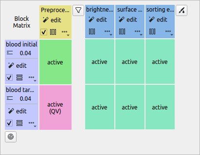
The Block Matrix gives an overview of the current analysis pipeline. Each row represents a dataset (purple). The columns represent either filters (yellow) or plots (blue) of your pipeline. You can change the order of datasets via the Edit|Change dataset order menu bar entry.
You can perform dataset operations in the purple rectangular area at the beginning of each row: To modify a dataset, click on the edit button. You can duplicate, insert anew (unmodified), or remove datasets using the dropdown menu. You can also exclude a dataset from an analysis via the check box.
Filters can also be modified, copied, removed and disabled. By default, all filters are disabled when they are created. To apply a filter to a dataset, click on the corresponding matrix element. The element changes its color from gray (incactive) to green (active). In Shape-Out, all filters that are applied to a dataset are called a filter ray. In the above example, the filter ray only consists of a single filter for each dataset. Filter rays may be different for each dataset.
By holding down the Shift key while clicking on a matrix element, you can activate the Quick View for the specific dataset (with filters applied up until the selected column). The block matrix element is then colored pink.
To add a plot, click on the New Plot button in the tool bar. This adds a plot column with a blue header to the Block Matrix and creates an empty plot window. You can add datasets to your plot by clicking on the corresponding matrix elements. In the above example, both datasets are being used in all three plots.
The modification of datasets, filters, and plots is discussed below.
Workspace
The Workspace is designed as an infinite scrollable area and contains all plot windows as well as the Quick View and Analysis View windows.
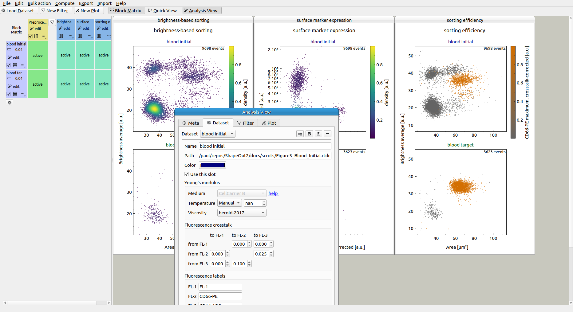
Analysis View
The analysis view consists of seven tabs that allow you to inspect the datasets loaded and to perform filtering and plotting actions.
Meta
The Meta tab displays all metadata of the selected dataset that are stored in the original .rtdc file. Here you can check and compare measurement and postprocessing parameters.
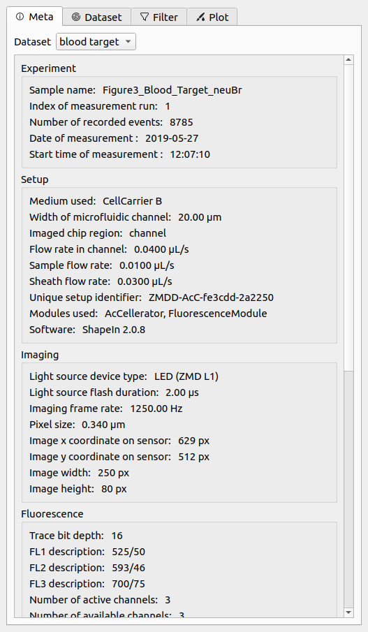
Fig. 9 Meta tab in the Analysis View.
Basins
The Basins tab yields insight into the basins that are loaded for a dataset. Find out more about basins in the dclab documentation.
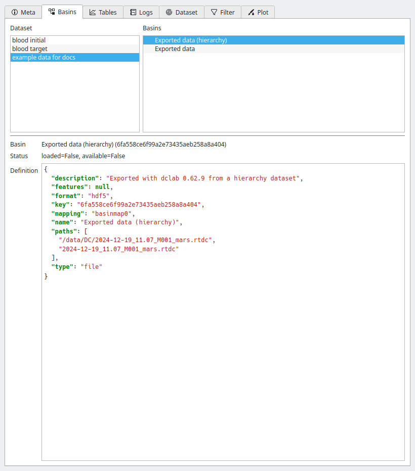
Fig. 10 Basins tab in the Analysis View.
Tables
The Tables tab allows you to visualize additional telemetry recorded during the measurement. You can use it for quality control and to identify reasons for temporal trends within a dataset.
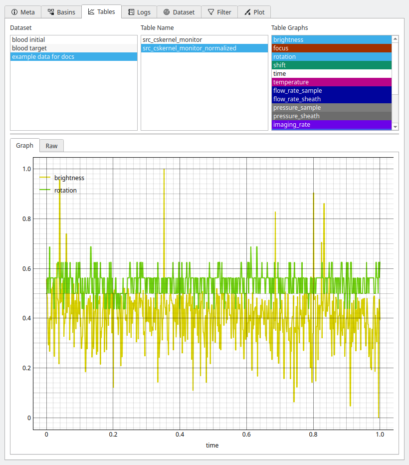
Fig. 11 Tables tab in the Analysis View.
Logs
The Logs tab gives access to all logs stored in a dataset.
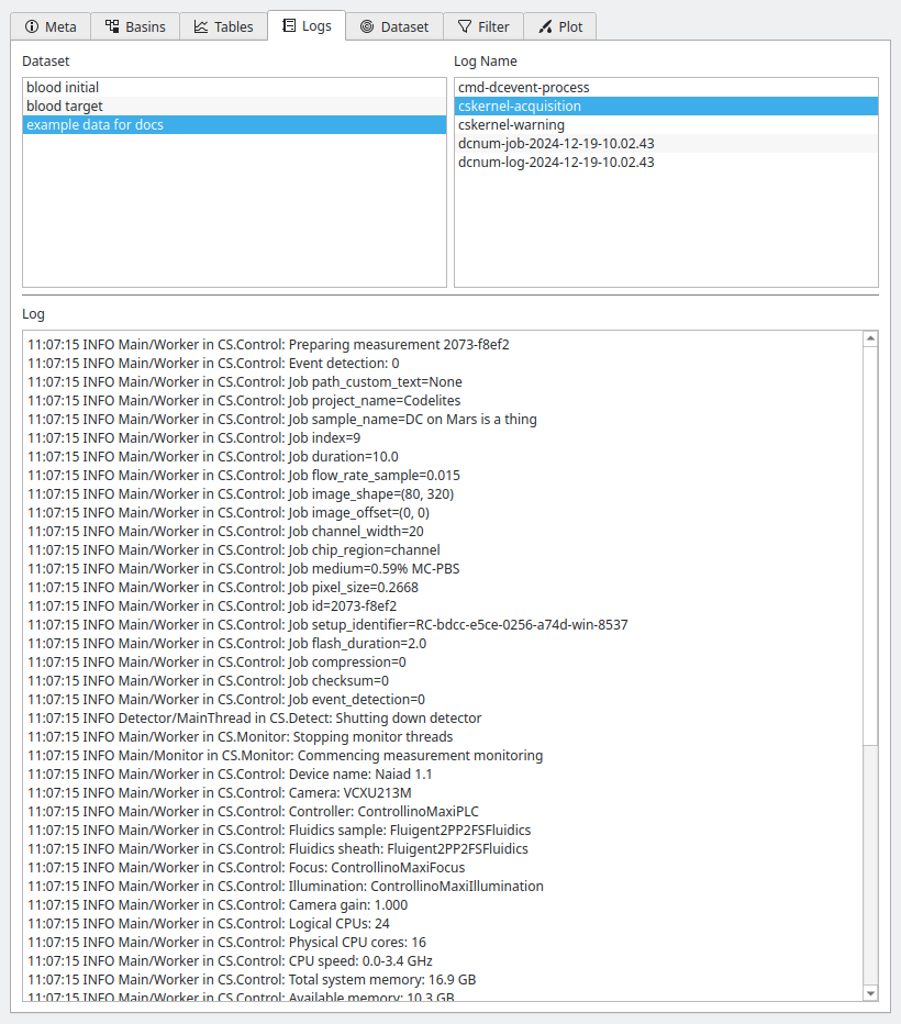
Fig. 12 Logs tab in the Analysis View.
Dataset
The Dataset tab allows to specify additional metadata, such as unique colors used for plotting and additional metadata for computing the Young’s modulus or correcting for fluorescence cross-talk. It also allows to specify fluorescence channel labels that will then be used for labeling the axes of plots.
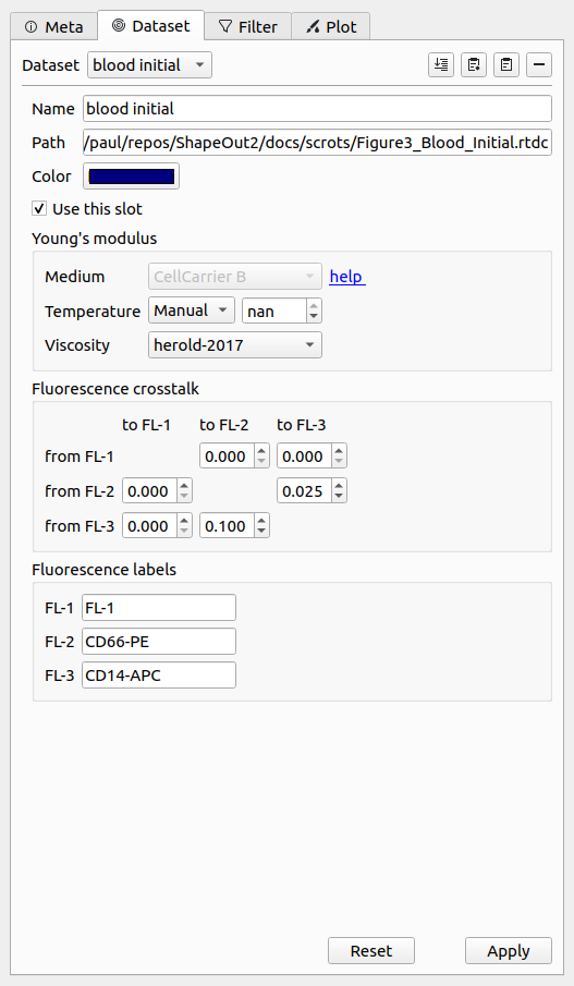
Fig. 13 Dataset tab in the Analysis View.
Filter
The Filter tab is used to modify the filters of the pipeline. New box filters can be added by selecting Choose box filters…. Polygon filters are created in the Quick View window.
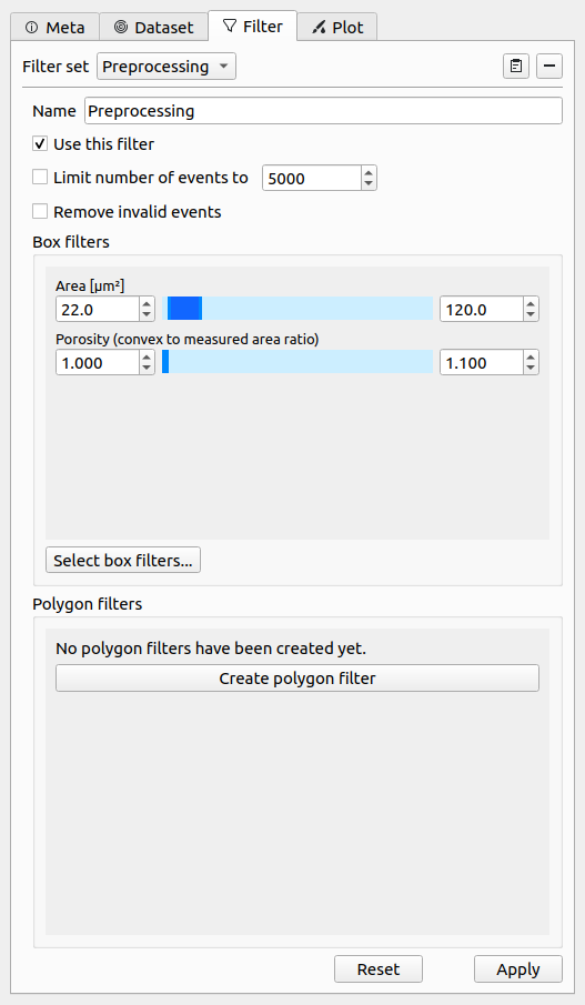
Fig. 14 Filter tab in the Analysis View.
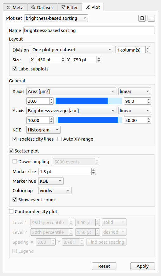
Plot
The Plot tab allows to specify all plotting parameters. Please take special note of the Division option in the Layout section (defines the arrangement of the subplots) and the Marker hue option in the Scatter plot section (allows you the specify whether the scatter data points are colored according to a kernel density estimate (KDE), another feature dimension, or the dataset color specified in the Dataset tab). In this example, contour plots are not used.
Quick View
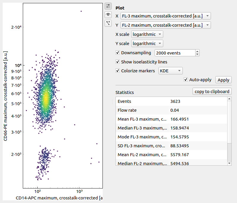
The Quick View is meant for dataset exploration. It consists of a scatter plot on the left (left click for panning and right-click for zooming) and a set of tool panels that are accessible via the corresponding tool buttons on the right.
Use the Plot panel to define all plot parameters. It also displays common statistics of the two features plotted. The drop down menus for the X and Y axes list the available features for the current dataset. The background color for each of the features is an indicator for the feature availability:
green: The feature data are present in the current dataset or are already computed.
blue: The feature data are part of another dataset, a basin, which may at a remote location (e.g. on DCOR) or on the local file system.
orange: The feature data must be computed before it can be displayed. The feature is an ancillary feature.
The Event panel displays all parameters of an individual event. You can select single events by clicking in the scatter plot or by scrolling through the Index spin control. If available, the event image is shown alongside the fluorescence trace of the event. All features of the event are listed in a separate tab.
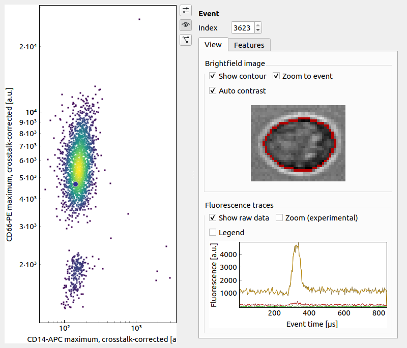
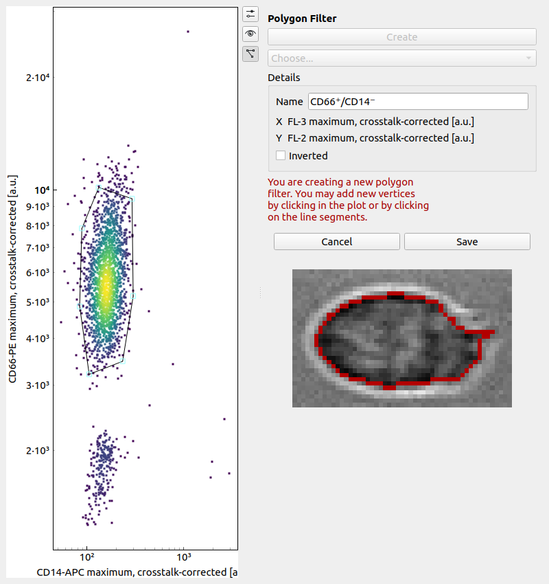
The Polygon Filter panel allows you to create and modify polygon filters. When the panel is active you can move the mouse pointer across the scatter plot and the image of the event closest to the mouse pointer is displayed.